- Role
- Product Designer
- Duration
- 2023
- Tools
- FramerFigmaCursorAdobe PhotoshopAdobe Illustrator
- Team
- DeveloperMarketing
MAP3
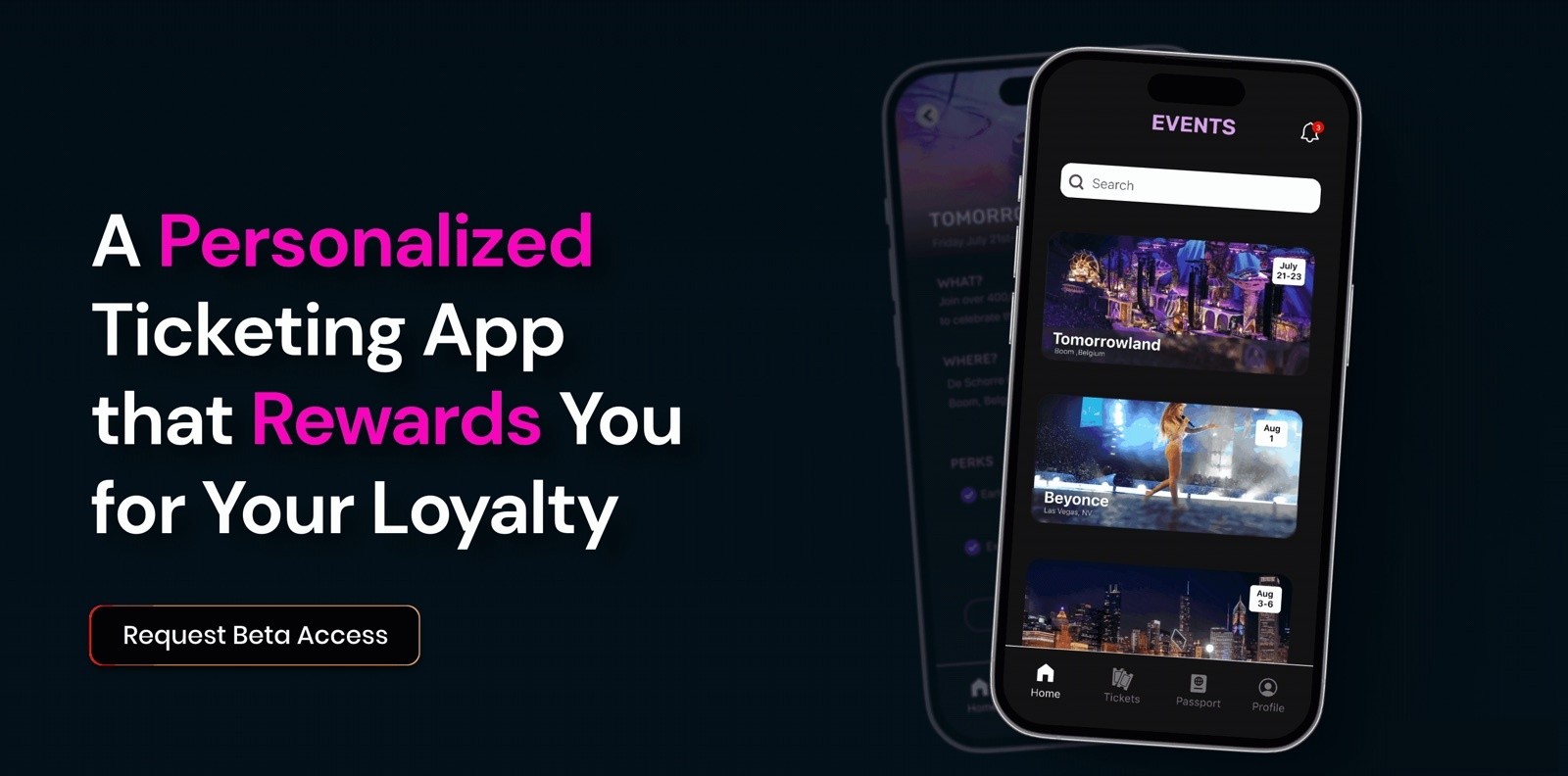
2023MAP3 is a ticketing platform with loyalty rewards built in.
On MAP3 I was the product designer: I led the UX research, built the brand and design system, designed the mobile app’s front end and helped design its back end, created the landing page to attract early customers and produced the pitch deck for investors.
Context
Overview
MAP3 was a 2023 Web3 startup building a ticketing platform with loyalty rewards built in. Using blockchain, it could recognize an artist’s superfans and reward them for showing up: early entry, exclusive merch and perks that grow with every event they attend. The team had the idea but nothing to show yet, so they asked me to take MAP3 from concept to an investor-ready product: a brand, a mobile app people would want to use, a landing page to build an early waitlist and a pitch deck to raise funding, all in 8 weeks.
My role
The challenge
Fans see ticketing as overpriced, unreliable and controlled by a few big players. Shows sell out in seconds, bots grab the best seats and resale tickets climb past $1,500, while the most loyal fans get nothing back for years of showing up. On top of that, Web3 can feel exclusive and risky to anyone outside crypto. The challenge was to design a ticketing and rewards platform people would trust and actually use: one that hides the blockchain behind a familiar, simple experience and makes rewards feel earned.
DesignResearch
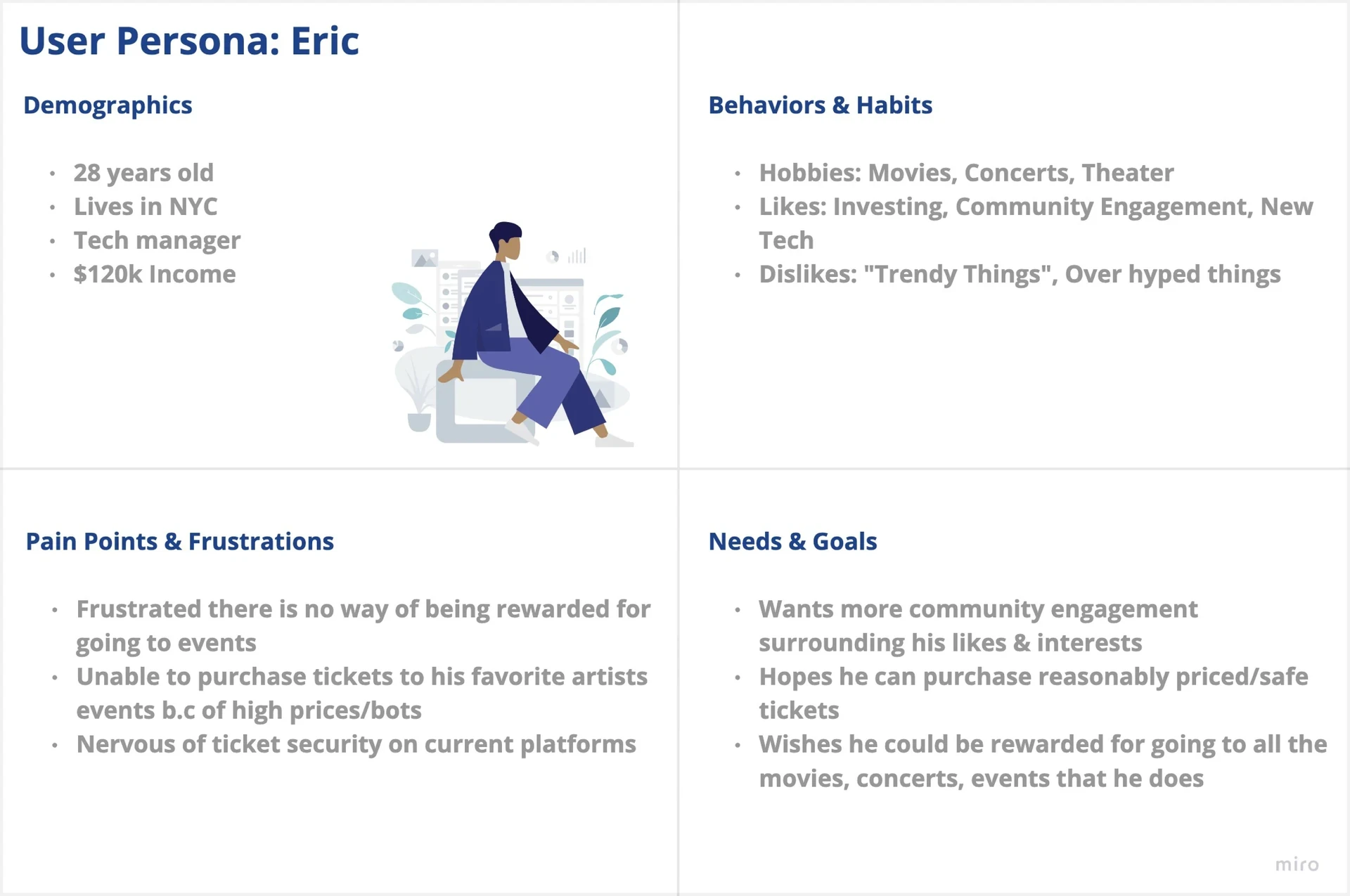
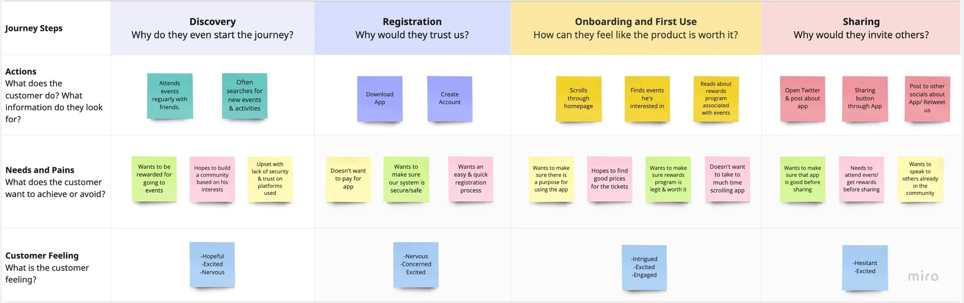
I started with who the customer is, what they want and where the journey breaks down, through a competitive analysis of existing ticketing platforms, user personas and journey mapping, then user testing as the designs took shape. Mapping the journey showed what the app’s foundation needed and where pain points would appear.
DesignBrand and design system
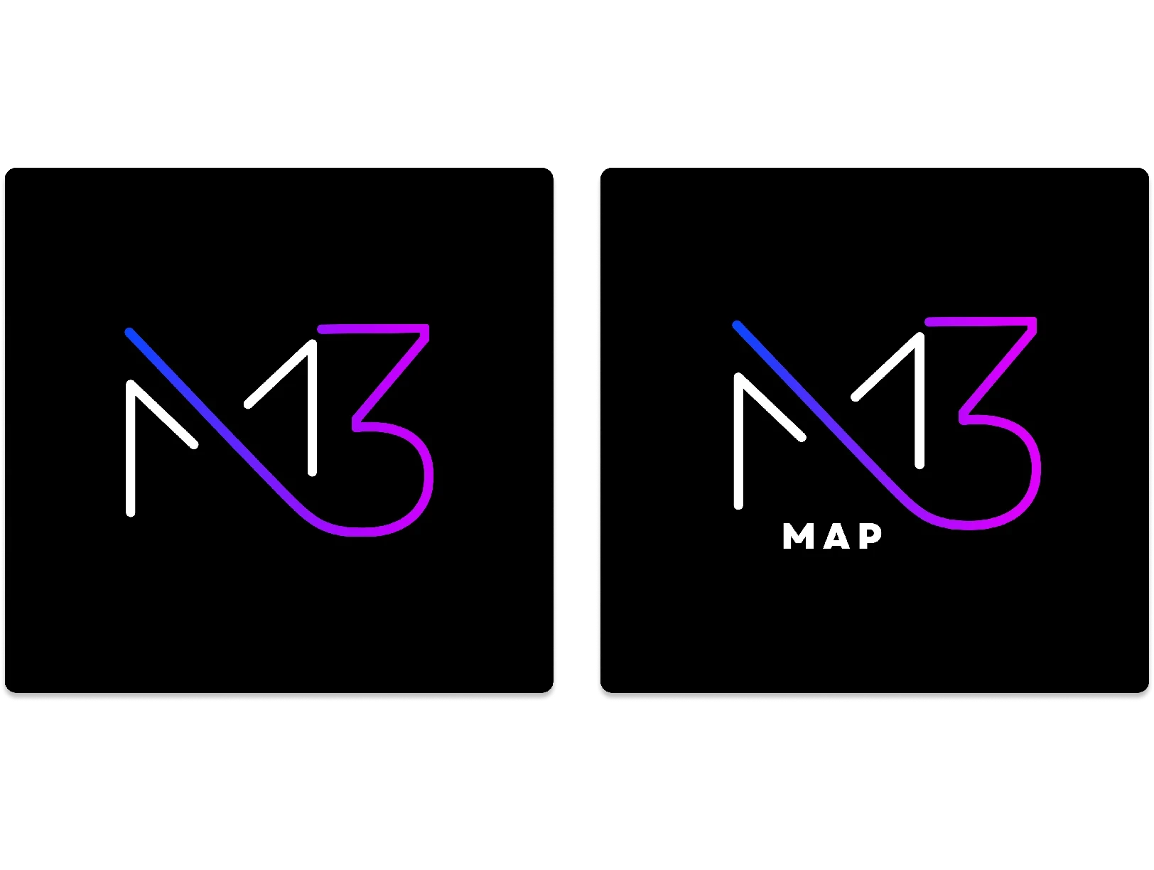
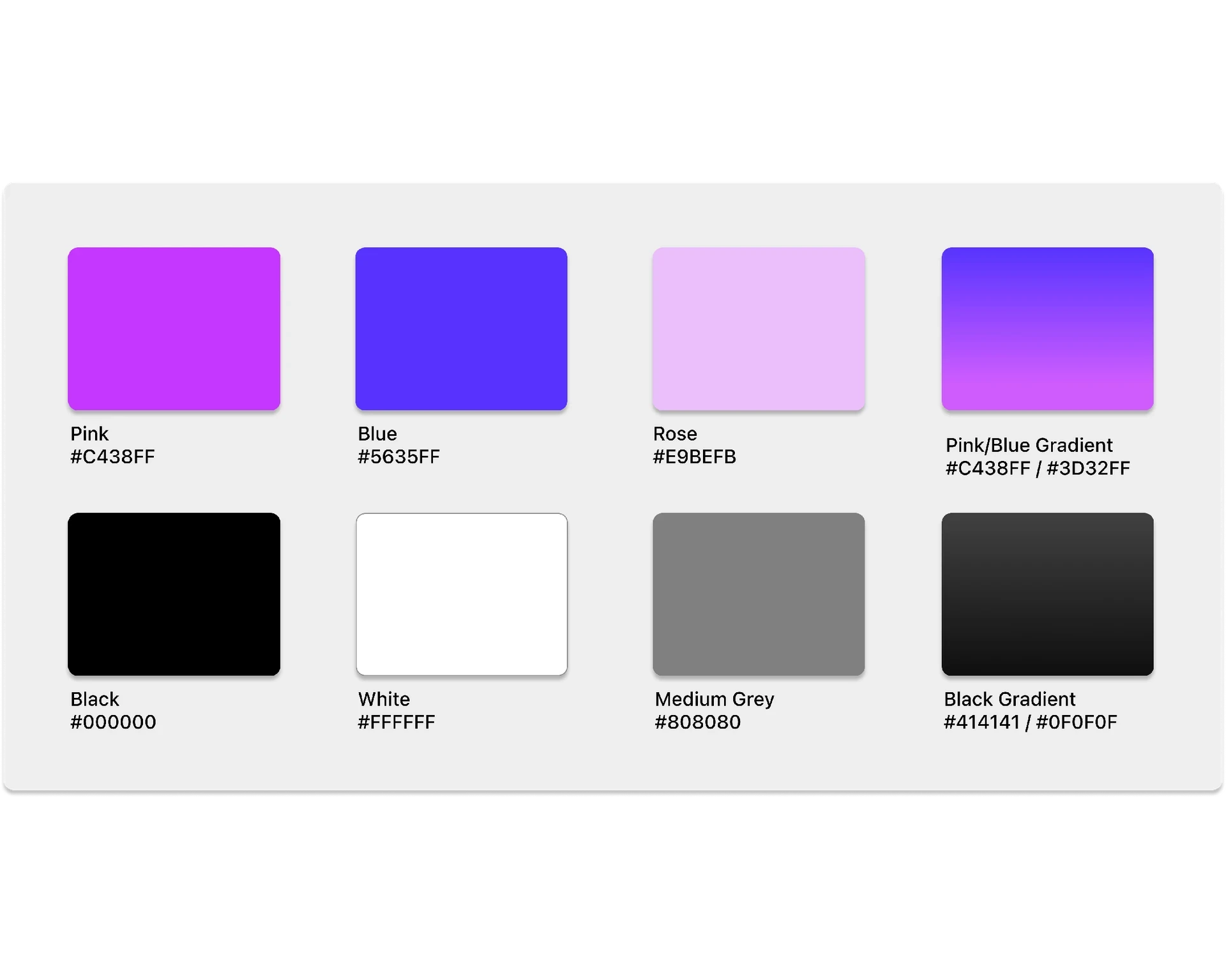
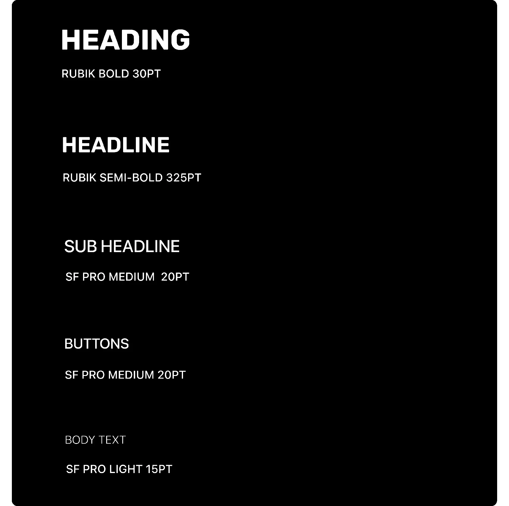
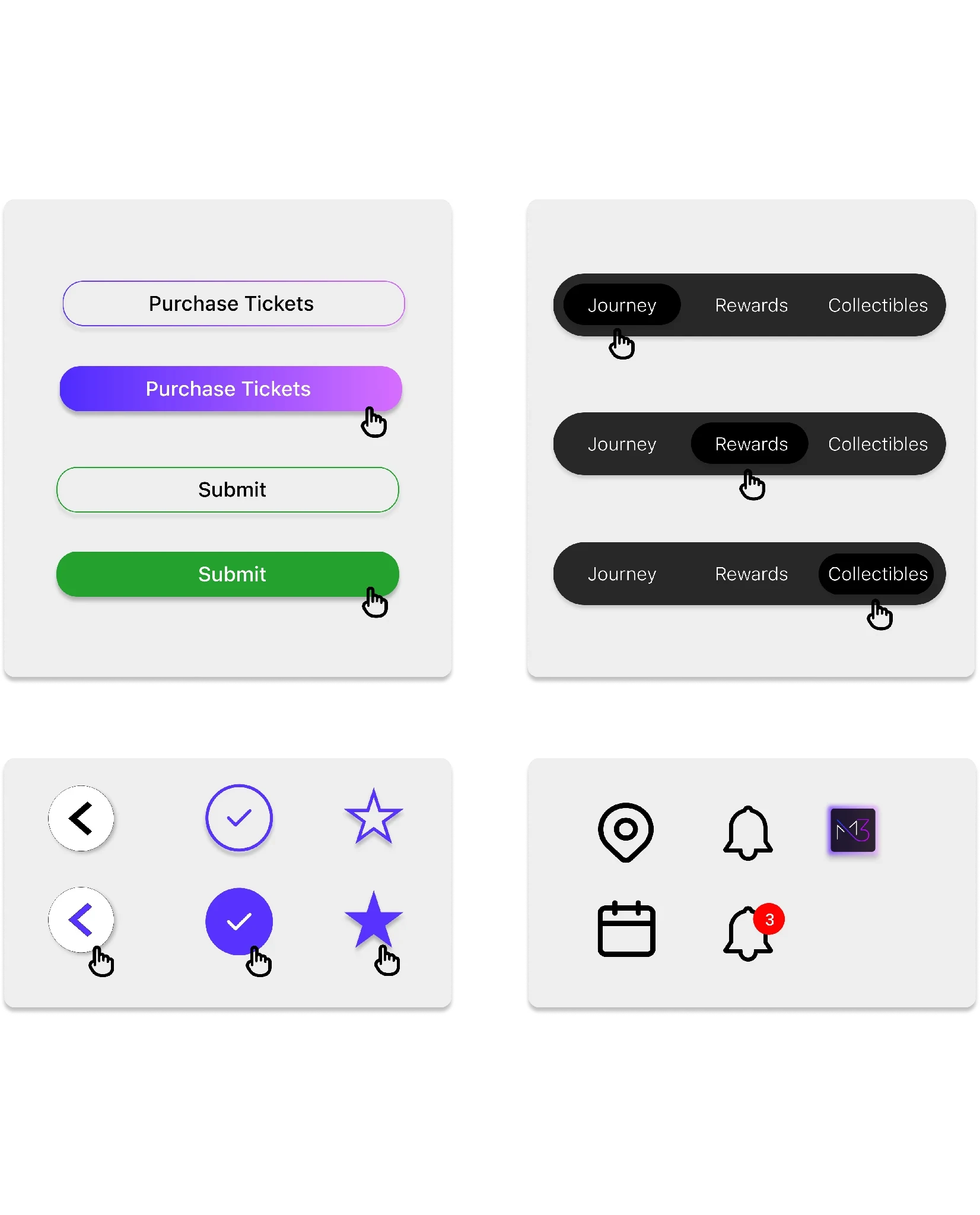
I built one visual language for Web2 and Web3: blue for Web2, pink for Web3 and a gradient that blends both. The logo connects the M and the 3 with a single unbroken line, Rubik carries headlines and SF Pro runs the interface.
DesignWireframes
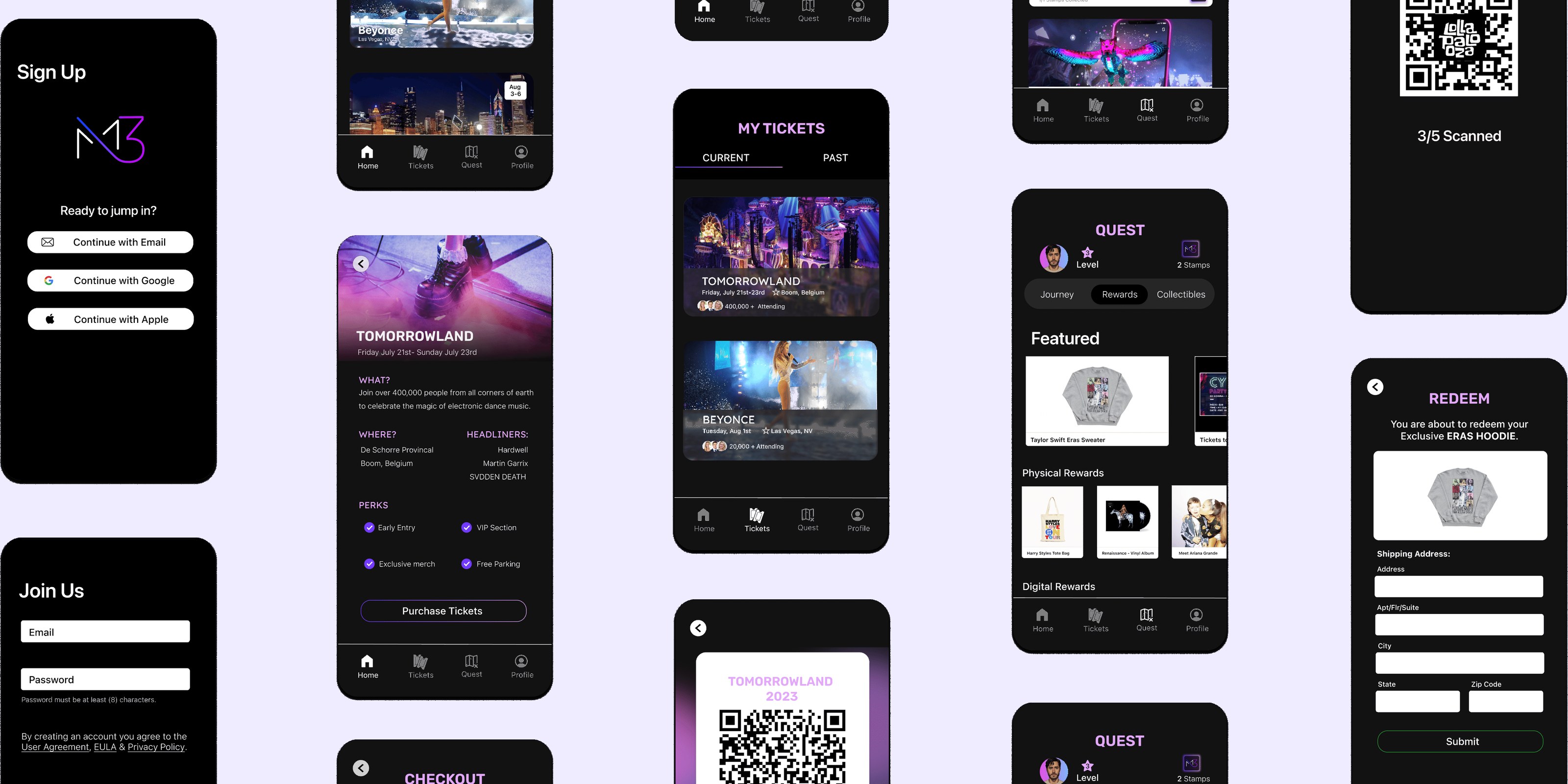
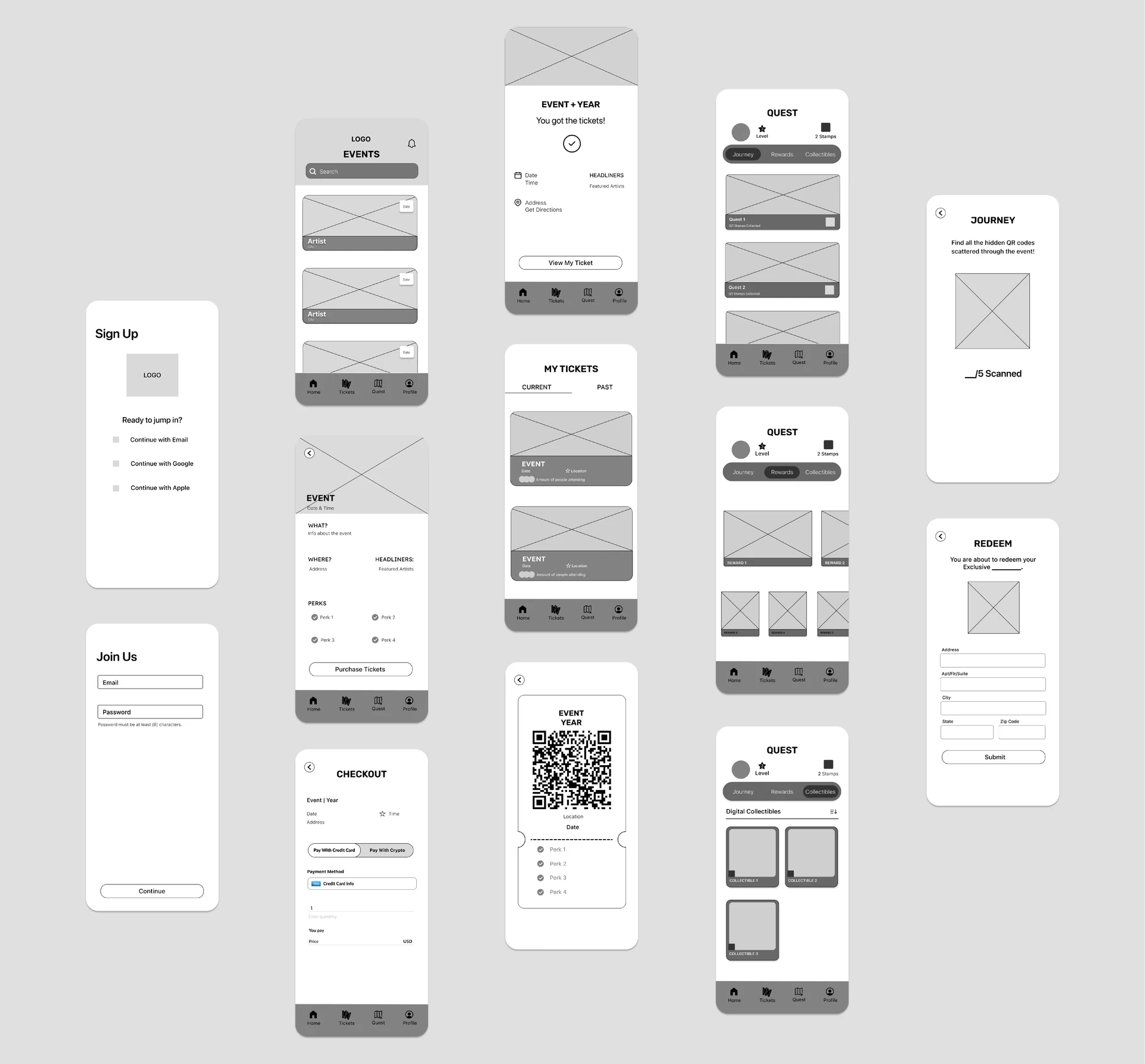
I kept the UI clean and image-first. Research showed people wanted quick, simple interactions, so search sits up top, events are full-bleed cards and everything else is one tab away.
LaunchFinal designs
The final app pairs bold imagery and vivid icons with simple navigation. The app has two routes: find events and buy tickets, or collect rewards and stamps.
LaunchLanding page
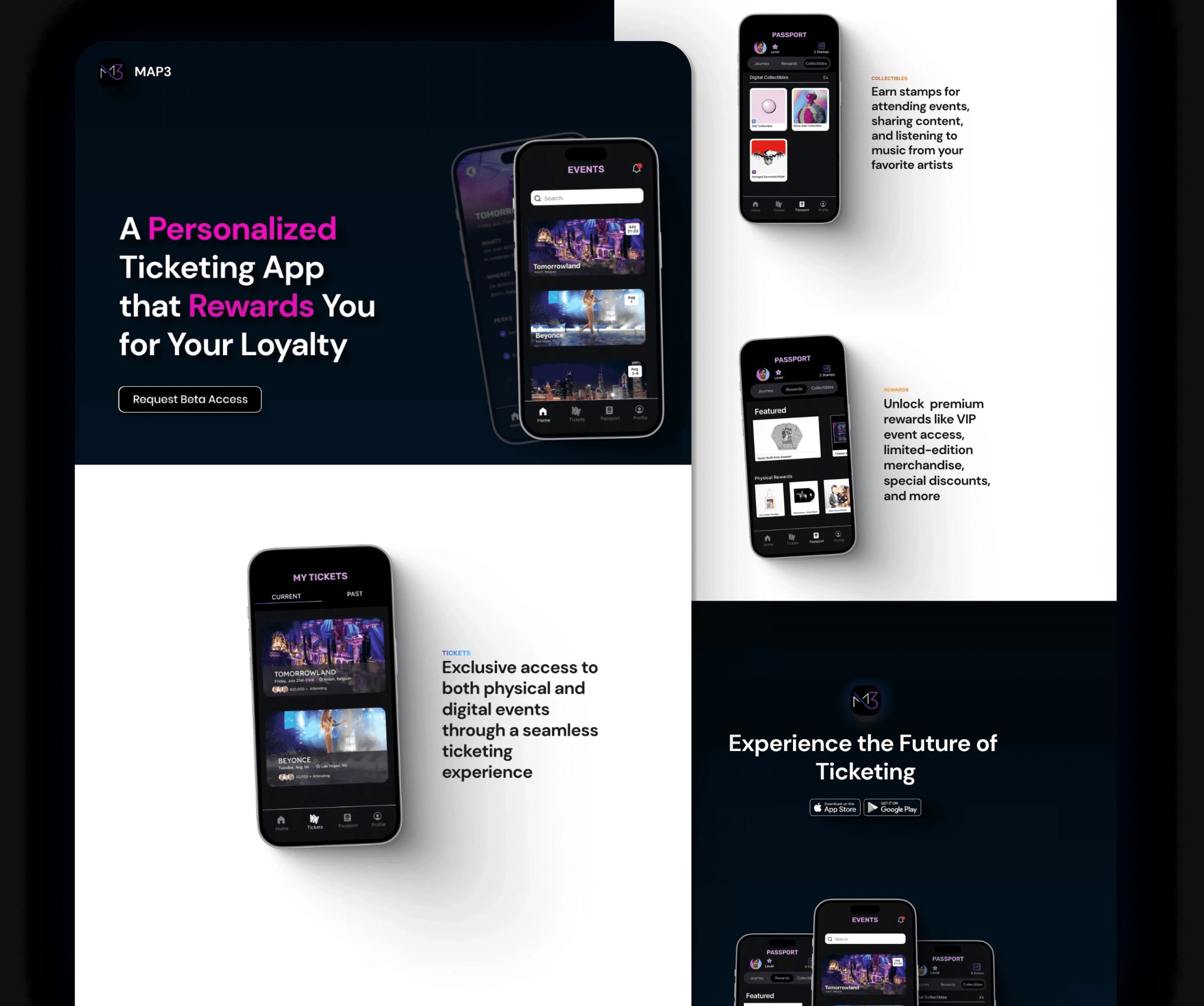
The landing page had to sell the idea before the app was in hand. The first wireframes felt repetitive, so I added phones that transition into one another as you scroll, taking cues from Apple’s product pages.
Result
I gave MAP3 everything it needed to pitch: a brand, a mobile app, a landing page and an investor deck, designed as one system. The landing page built a waitlist of 500+ fans, and 40+ beta users tested the app before launch.
- 8 weeks
- from brand to investor-ready product
- 500+
- waitlist signups from the landing page
- 40+
- beta users testing the app
Takeaways
A tight timeline keeps you focused.
We only had 8 weeks to go from an idea to a product we could pitch, so I had to decide fast what really mattered. It taught me to focus on the core experience first and save the extras for later, and it made the final product stronger because every screen had a clear purpose.
Designing for fans and investors at once.
The same product had to excite fans and convince investors. I learned to tell one story that worked for both: fans needed to see why they’d want to use it, and investors needed to see why it would work. Designing the app, the landing page and the pitch deck together made that story feel consistent everywhere.
What I’d do next
The product was ready to pitch. With more time, I’d add these.
- 01A full interactive website
Expand the landing page into a full site that walks fans through the whole product.
- 02Gamified rewards
Take inspiration from Duolingo’s gamified approach, with streaks, levels and milestones, so collecting stamps feels like a game fans want to keep playing.
- 03Community features
Let fans message each other and connect around the artists they love.