MOMO
MOMO
MOMO
Product Design - Web Design - Branding
Product Design - Web Design - Branding
MOMO is an e-commerce app dedicated to plants, offering low-cost options and added advantages. Perks consist of subscription-based solutions, rapid delivery, and guidance from plant specialists.
The company's aim is to provide a delightful and straightforward plant shopping experience while maintaining budget-friendly rates.
CLIENT
MOMO
CLIENT
MOMO
CLIENT
MOMO
ROLE
User Experience Designer, Product Designer
ROLE
User Experience Designer, Product Designer
ROLE
User Experience Designer, Product Designer
BRIEF
Design the first plant app of it's kind that is
easy to use, offers special perks & has a
personalized help team.
BRIEF
Design the first plant app of it's kind that is easy to use, offers special perks & has a personalized help team.
BRIEF
Design the first plant app of it's kind that is easy to use, offers special perks & has a personalized help team.
Challenge
Currently, the plant market is saturated with competitors that fail to provide customers with essential requirements, reasonable pricing, a user friendly interface, automated services & dedicated assistance.
Challenge
Currently, the plant market is saturated with competitors that fail to provide customers with essential requirements, reasonable pricing, a user friendly interface, automated services & dedicated assistance.
Challenge
Currently, the plant industry is saturated with competitors that fail to provide customers with essential requirements, reasonable pricing, a user friendly interface, automated services & dedicated assistance.

Solution
Create a mobile application & service that offers state of the art guidance, fair prices and a strong User Interface.
Solution
Create a mobile application & service that offers state of the art guidance, fair prices and a strong User Interface.
Solution
Create a mobile application & service that offers state of the art guidance , fair prices & a strong User Interface.
Competitive Analysis
Examining market rivals played a crucial role in shaping this app's design and determining ways to distinguish Momo from its competitors. The main findings revealed that competitors have high prices, lack apps or offer subpar quality, and generally do not provide dedicated support.
The Design Process
The Design Process
The Design Process
Competitive Analysis
Examining market rivals played a crucial role in shaping this app's design and determining ways to distinguish Momo from its competitors. The main findings revealed that competitors have high prices, lack apps or offer subpar quality, and generally do not provide dedicated support.

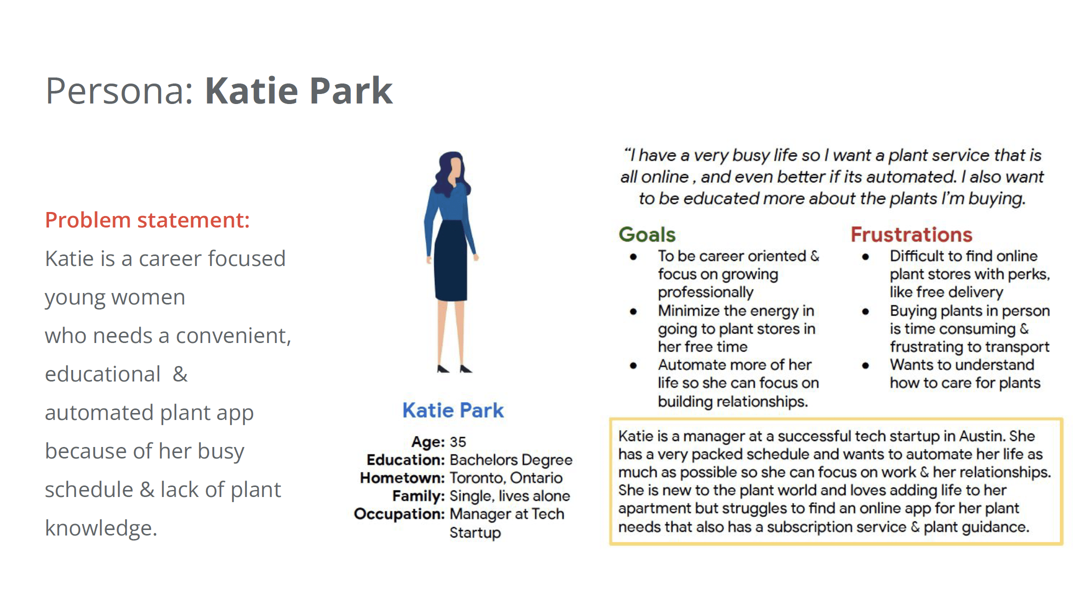
User Persona
Analyzing the key demographic for Momo was key to its success. I was able to identify who our customer is & what they are looking for. In summary, our customer is looking for a plant application that is convenient, educational & automated to keep up with their busy life.
User Persona
Analyzing the key demographic for Momo was key to its success. I was able to identify who our customer is & what they are looking for. In summary, our customer is looking for a plant application that is convenient, educational & automated to keep up with their busy life.
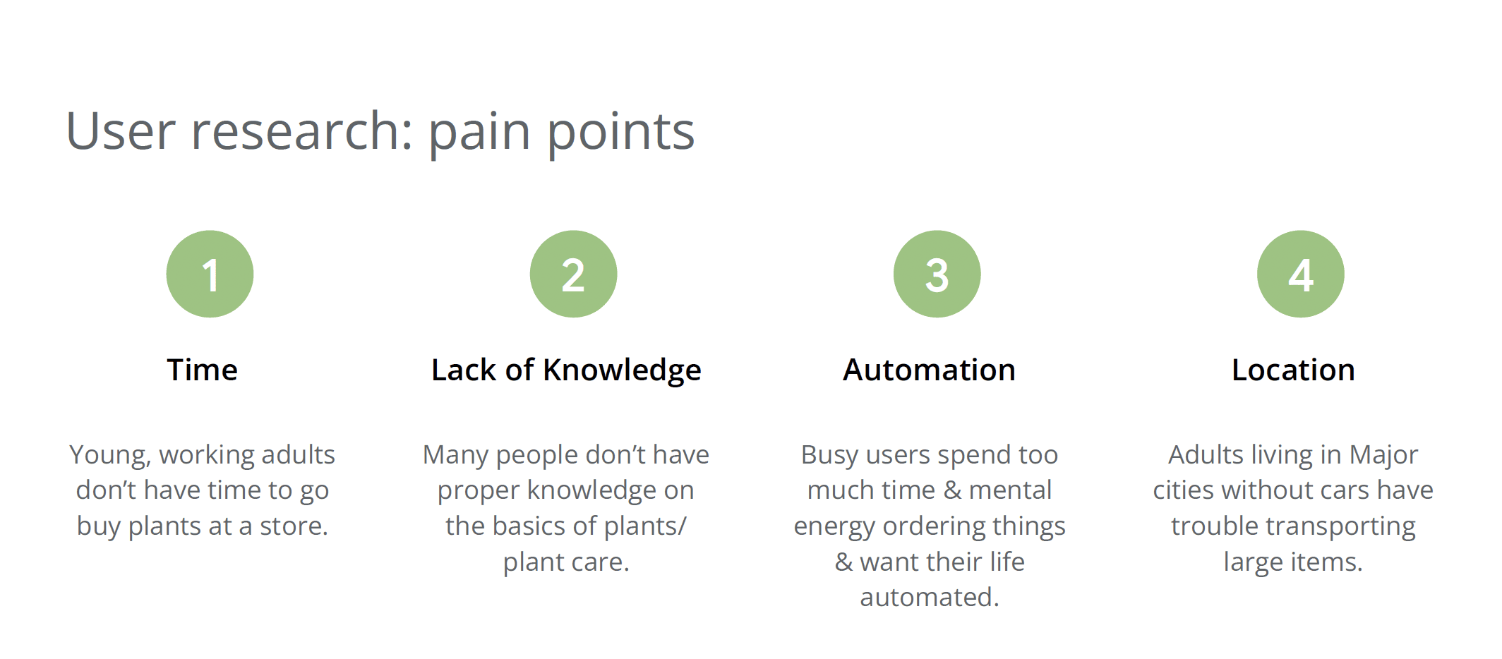
Pain Points
Through user research I was able to identify the key pain points that users are facing & that need to be addressed with the design of this app. The points include, lack of time for users, minimal knowledge in the basics of plant care, desire for automation & a need for online ordering due to locations.
Pain Points
Through user research I was able to identify the key points that users are facing & that need to be addressed with the design of this app. The points include, lack of time for users, minimal knowledge in the basics of plant care, desire for automation & a need for online ordering due to location.
User Persona:
Analyzing the key demographic for Momo was key to its success. I was able to identify who our customer is & what they are looking for. In summary, our customer is looking for a plant app. that is convenient, educational & automated to keep up with their busy life.
User Journey:
Through user research I was able to identify the key points that users are facing & that need to be addressed with the design of this app. The points include, lack of time for users, minimal knowledge in the basics of plant care, desire for automation & a need for online ordering due to location.
Design System
Design System
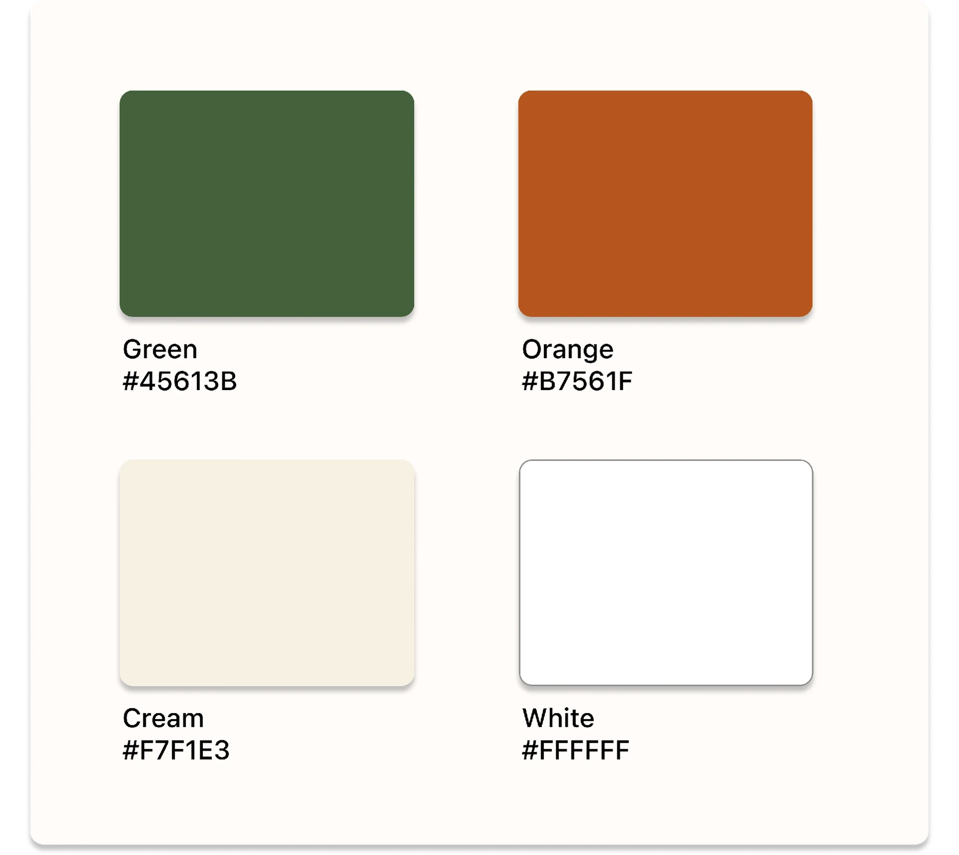
COLOR PALETTE:
The palette is designed with warm hues for the main colors & white/cream for the background colors.
COLOR PALETTE:
The palette is designed with warm hues for the main colors & white/cream for the background colors.
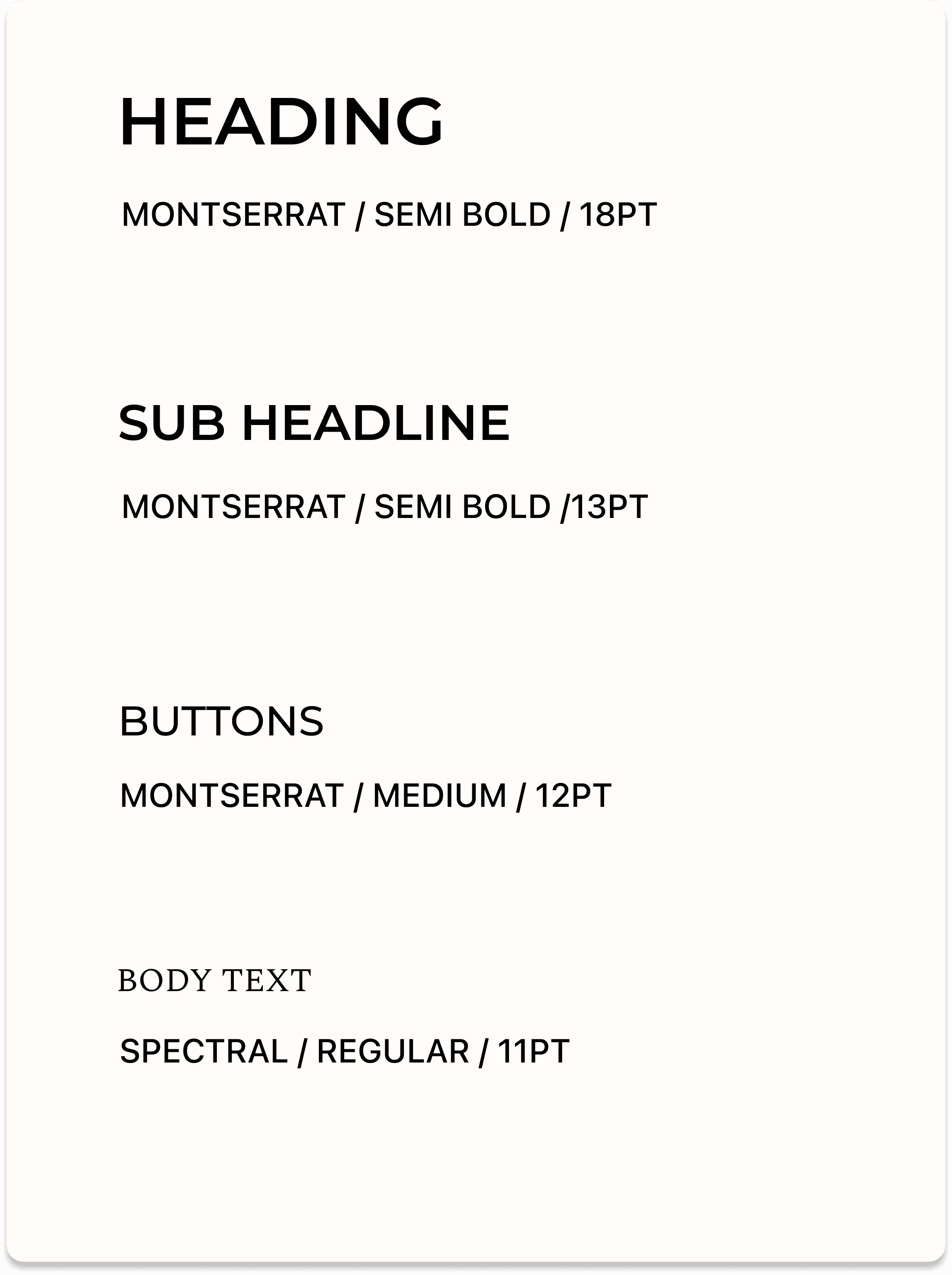
TYPOGRAPHY:
Combing a clean, bold sans-serif typeface, Montserrat with Spectral, a serif typeface that is optimized for screens, was a great combination for strong text hierarchy.
TYPOGRAPHY:
Combing a clean, bold sans-serif typeface, Montserrat with Spectral, a serif typeface that is optimized for screens, was a great combination for strong text hierarchy.
BUTTONS:
The main button has a thin line that fills in when clicked on for a positive user experience. For other buttons, they switch color from cream to orange when clicked on.
BUTTONS:
The main button has a thin line that fills in when clicked on for a positive user experience. For other buttons, they switch color from cream to orange when clicked on.
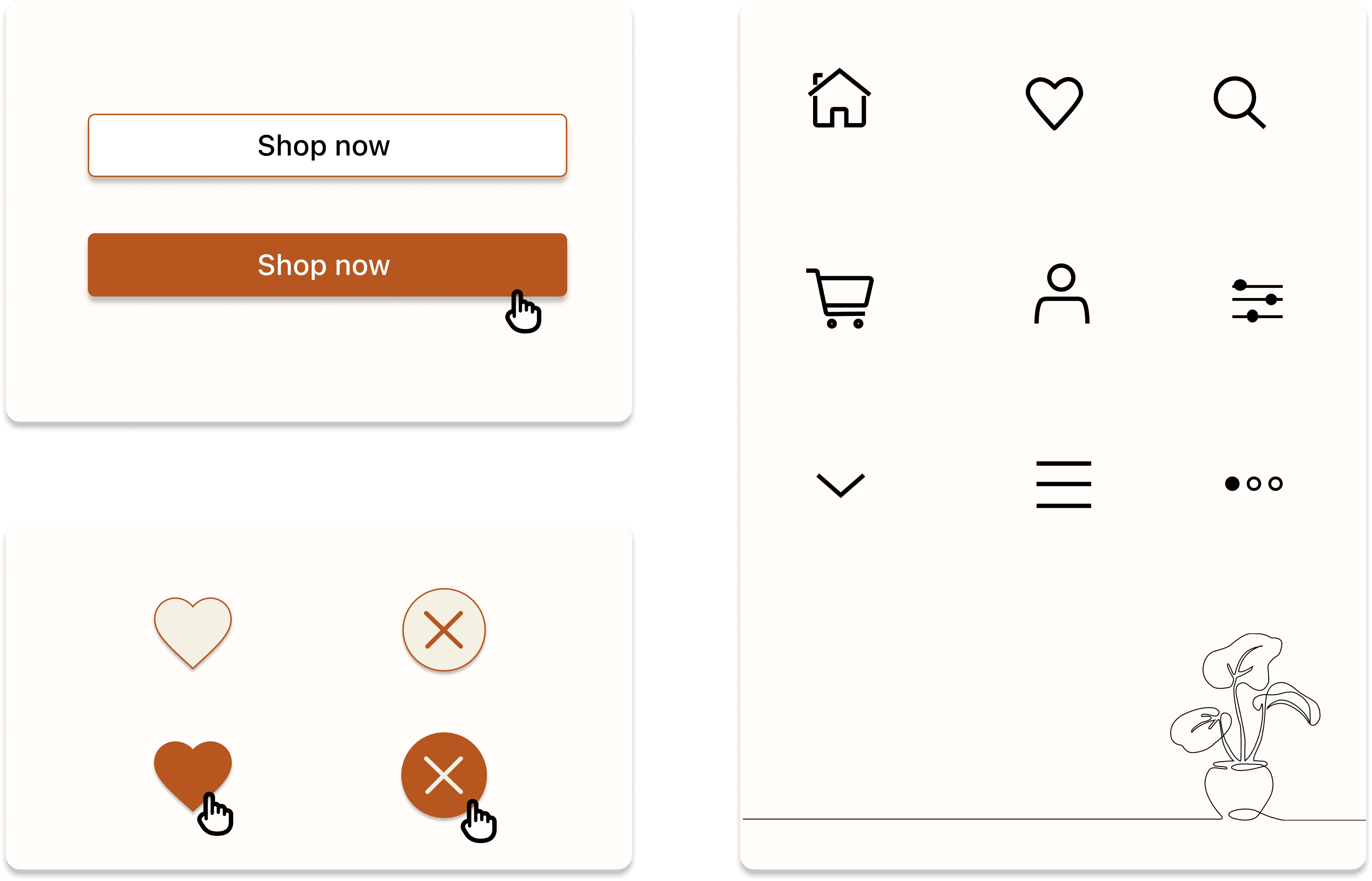
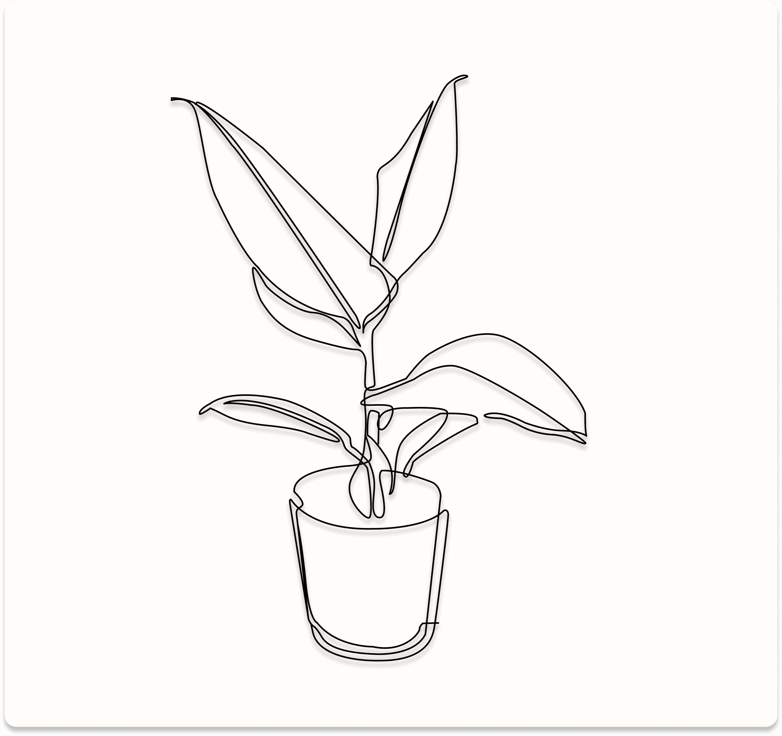
DESIGN ELEMENTS:
I wanted to add elements to the app that made it feel more natural & inviting so I created line drawings of plants, featured throughout.
DESIGN ELEMENTS:
I wanted to add elements to the app that made it feel more natural & inviting so I created line drawings of plants, featured throughout.
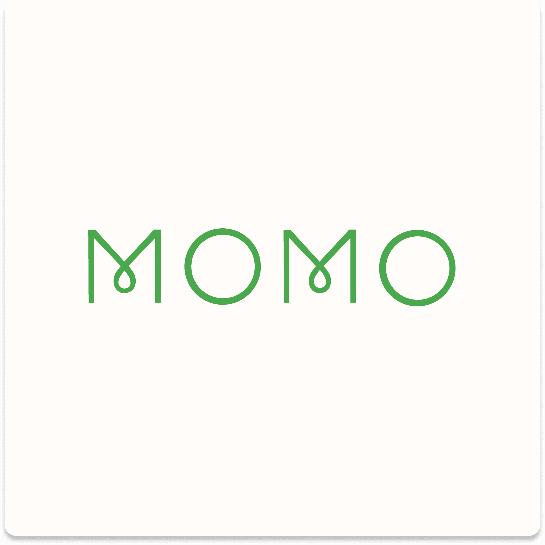
LOGO:
My goal behind the logo was to create a modern & minimalistic logo with rounded shapes.
LOGO:
My goal behind the logo was to create a modern & minimalistic logo with rounded shapes.
Design System
COLOR PALETTE:
The palette is designed with warm hues for the main colors & white/cream for the background colors.
TYPOGRAPHY:
Combing a clean, bold sans-serif typeface, Montserrat with Spectral, a serif typeface that is optimized for screens, was a great combination for strong text hierarchy.
BUTTONS:
The main button has a thin line that fills in when clicked on for a positive user experience. For other buttons, they switch color from cream to orange when clicked on.
DESIGN ELEMENTS:
I wanted to add elements to the app that made it feel more natural & inviting so I created line drawings of plants, featured throughout.
LOGO:
My goal behind the logo was to create a modern & minimalistic logo with rounded shapes.
Mobile App Design
Mobile App Design
Mobile App Design
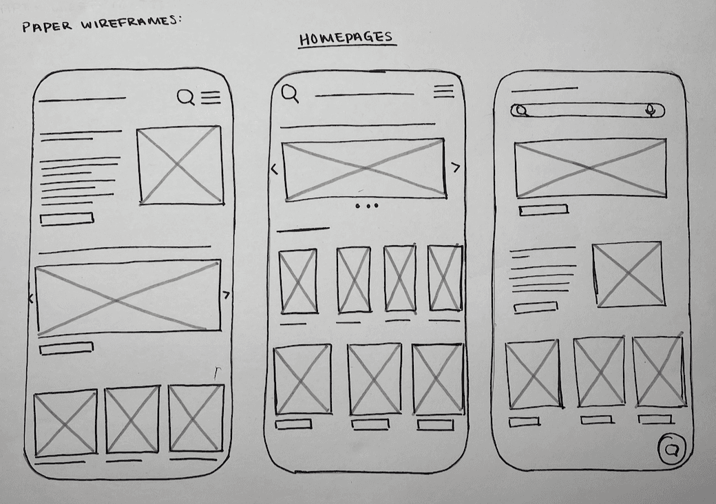
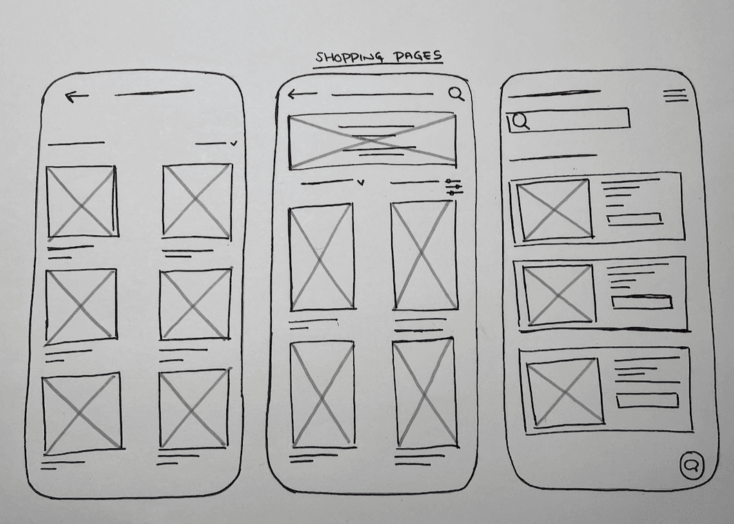
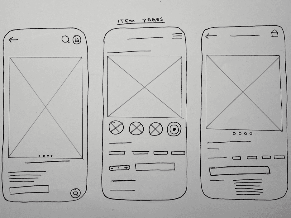
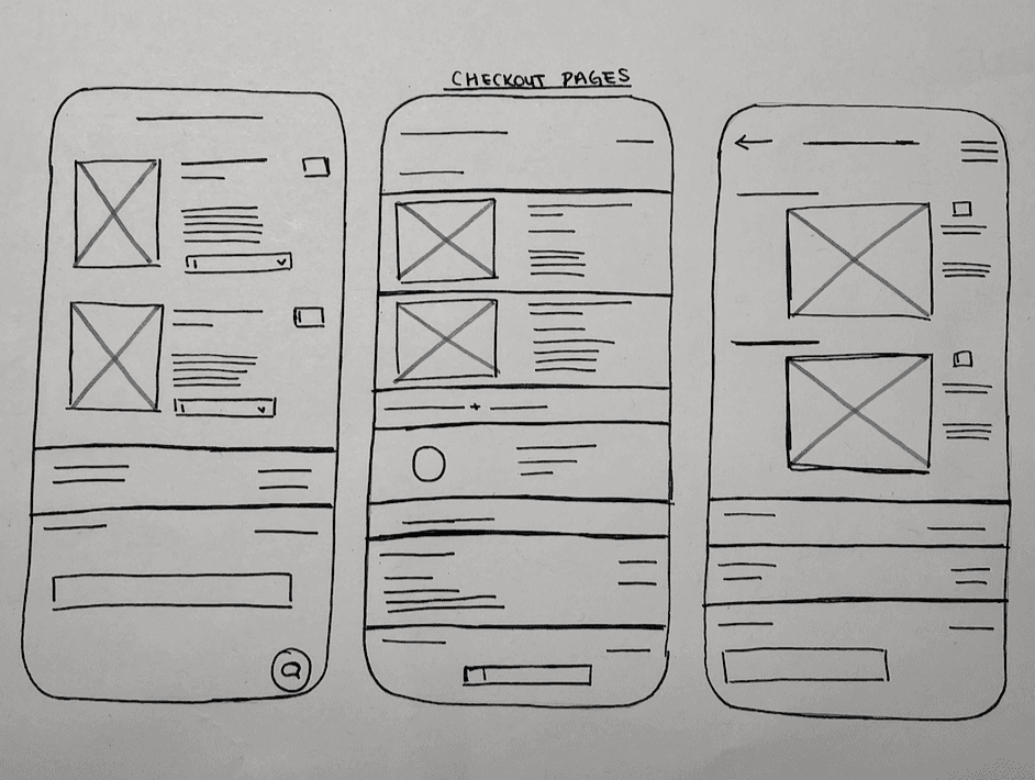
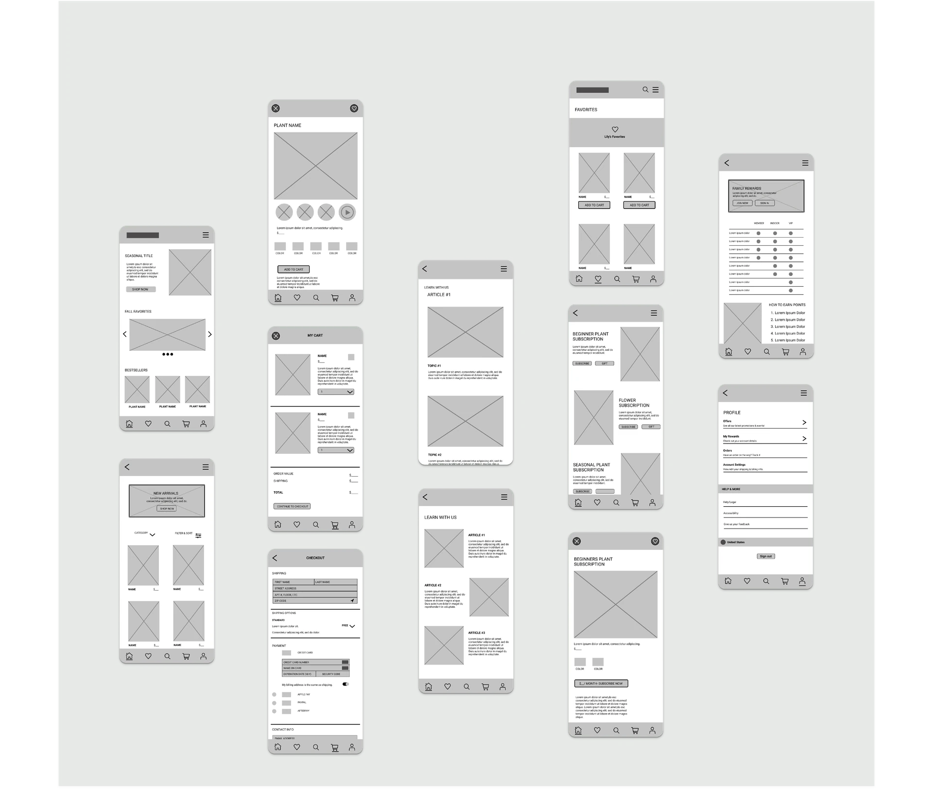
Low Fidelity Wireframes
Based on my research I learned that the key factors users were looking for was automation, ease of use & a clean interface. I took those points into account when designing the wireframes & creating a clean, image heavy interface.
Low Fidelity Wireframes
Based on my research I learned that the key factors users were looking for was automation, ease of use & a clean interface. I took those points into account when designing the wireframes & creating a clean, image heavy interface.
Low Fidelity Wireframes
Based on my research I learned that the key factors users were looking for was automation, ease of use & a clean interface. I took those points into account when designing the wireframes & creating a clean, image heavy interface.
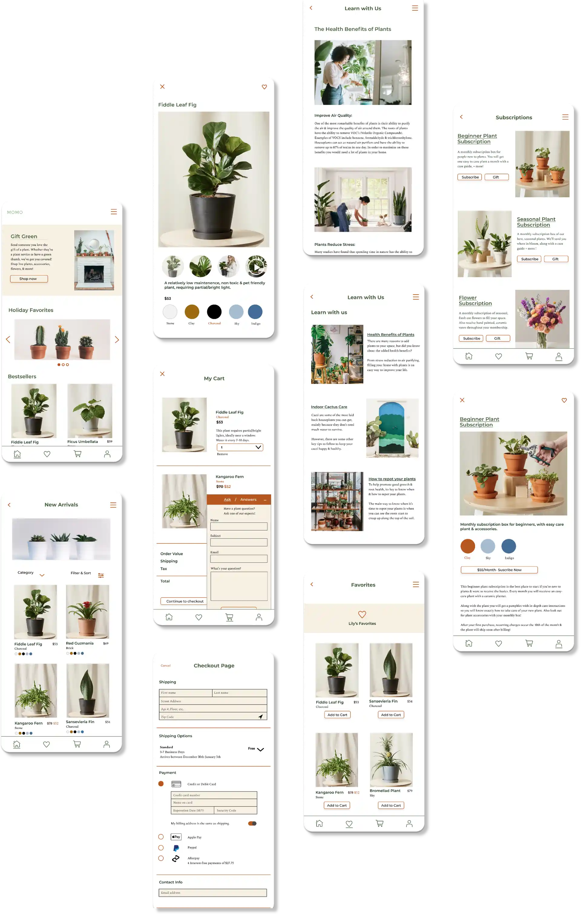
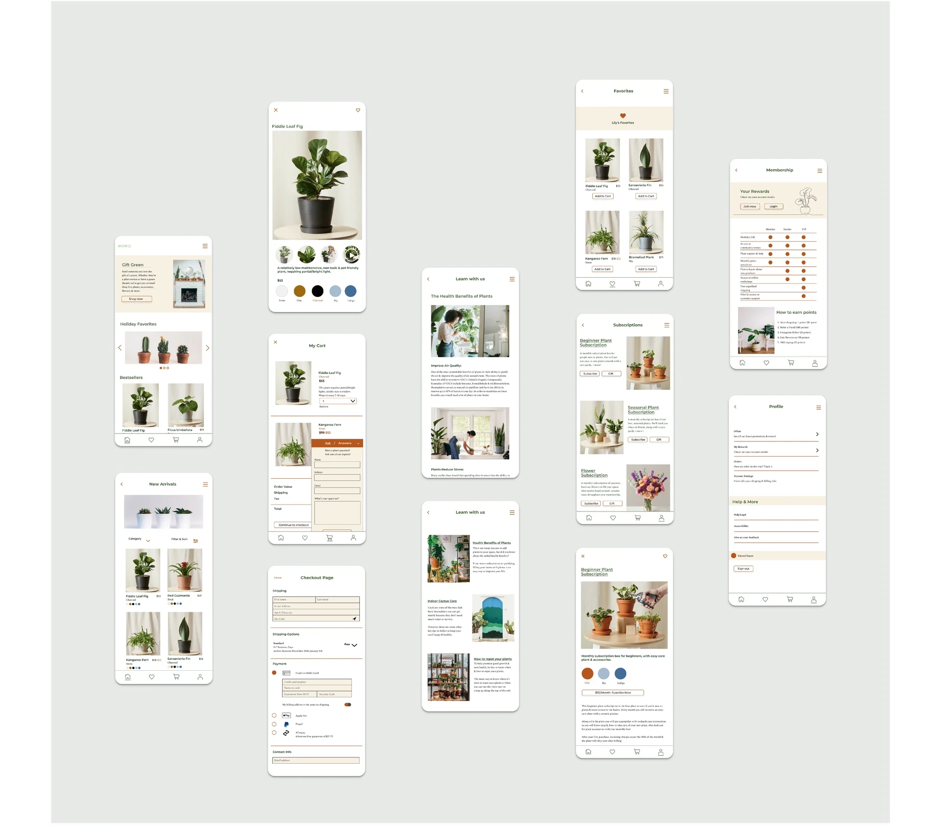
High Fidelity Wireframes
When working on the high fidelity wireframes I wanted to make sure that there was a clear & easy user flow. I also wanted to include multiple sections of the app to keep the user engaged, for example a "learn" page with articles written by plant experts.
High Fidelity Wireframes
When working on the high fidelity wireframes I wanted to make sure that there was a clear & easy user flow. I also wanted to include multiple sections of the app to keep the user engaged, for example a "learn" page with articles written by plant experts.
High Fidelity Wireframes
When working on the high fidelity wireframes I wanted to make sure that there was a clear & easy user flow. I also wanted to include multiple sections of the app to keep the user engaged, for example a "learn" page with articles written by plant experts.
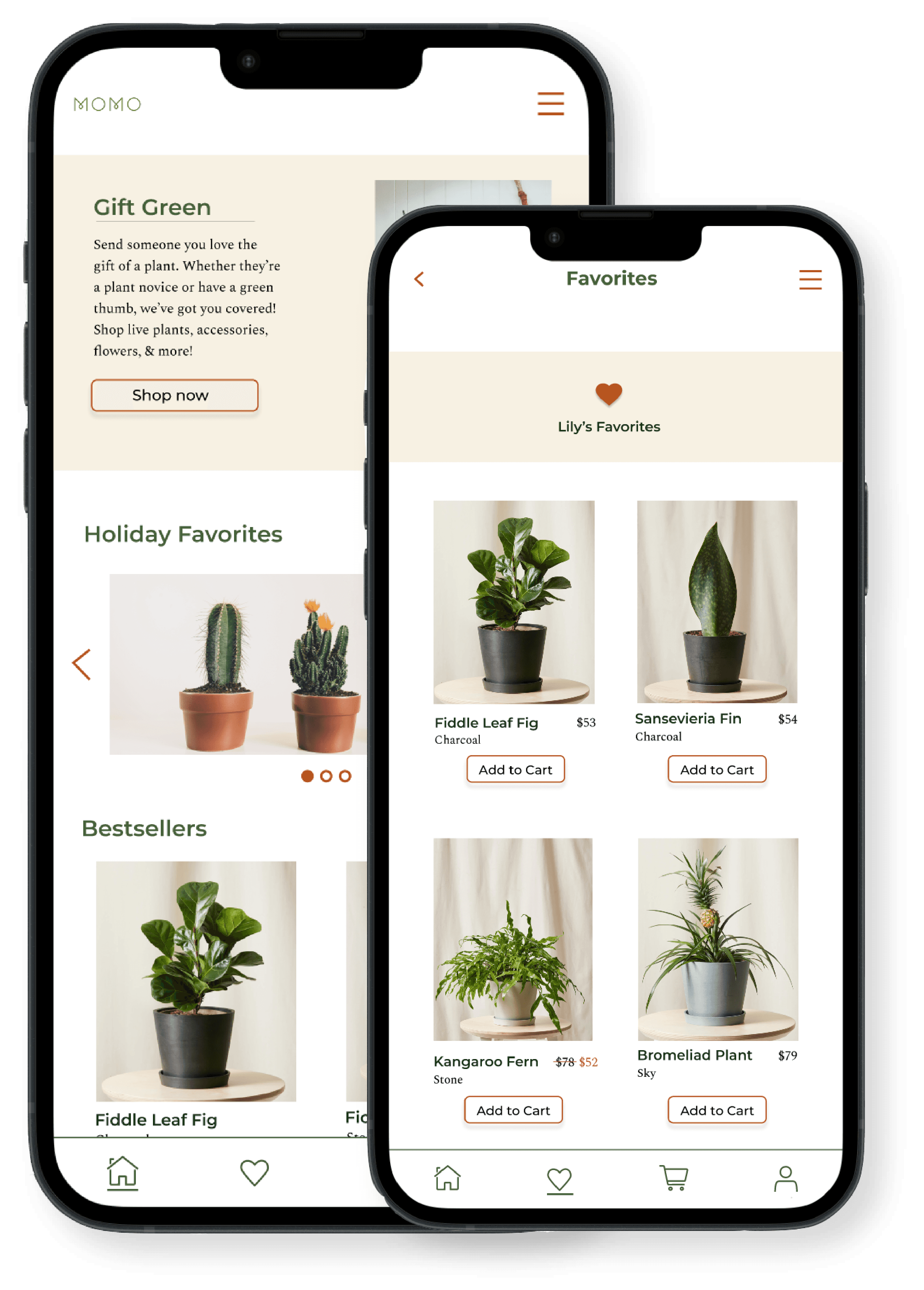
Final Designs
The final layout of this application utilizes the green and orange as accent colors to the white & cream main colors, creating a clean, eye catching UI. I also created some digital line drawings that complement the imagery well.
Final Designs
The final layout of this application utilizes the green and orange as accent colors to the white & cream main colors, creating a clean, eye catching UI. I also created some digital line drawings that complement the imagery well.
Final Thoughts
Final Thoughts
Final Thoughts
IMPACT
My goal when designing this application was to make it very image heavy & clean. I also wanted to incorporate a learn page for users to reference.
I believe the overall design of this app was successful & is the first of it's kind in the market.
IMPACT
My goal when designing this application was to make it very image heavy & clean. I also wanted to incorporate a learn page for users to reference.
I believe the overall design of this app was successful & is the first of it's kind in the market.
IMPACT
My goal when designing this application was to make it very image heavy & clean. I also wanted to incorporate a learn page for users to reference.
I believe the overall design of this app was successful & is the first of it's kind in the market.
NEXT STEPS
Create a fully functioning mobile app that can be downloaded on the app store
Add a chat bot that can answer the users questions instantly & provide video guidance
Include in-app tracking for all orders placed
NEXT STEPS
Create a fully functioning mobile app that can be downloaded on the app store
Add a chat bot that can answer the users questions instantly & provide video guidance
Include in-app tracking for all orders placed
NEXT STEPS
Design a fully fleshed out interactive website
Rework the rewards section of the app to be more interactive
Add a community aspect to the app where people can message each other